WiFi Campaigns
with the Smart WiFi Campaign Designer
With OCMP Smart WiFi, it is possible to create, publish, and analyze effective marketing campaigns in WiFi very easily and quickly.
Overview
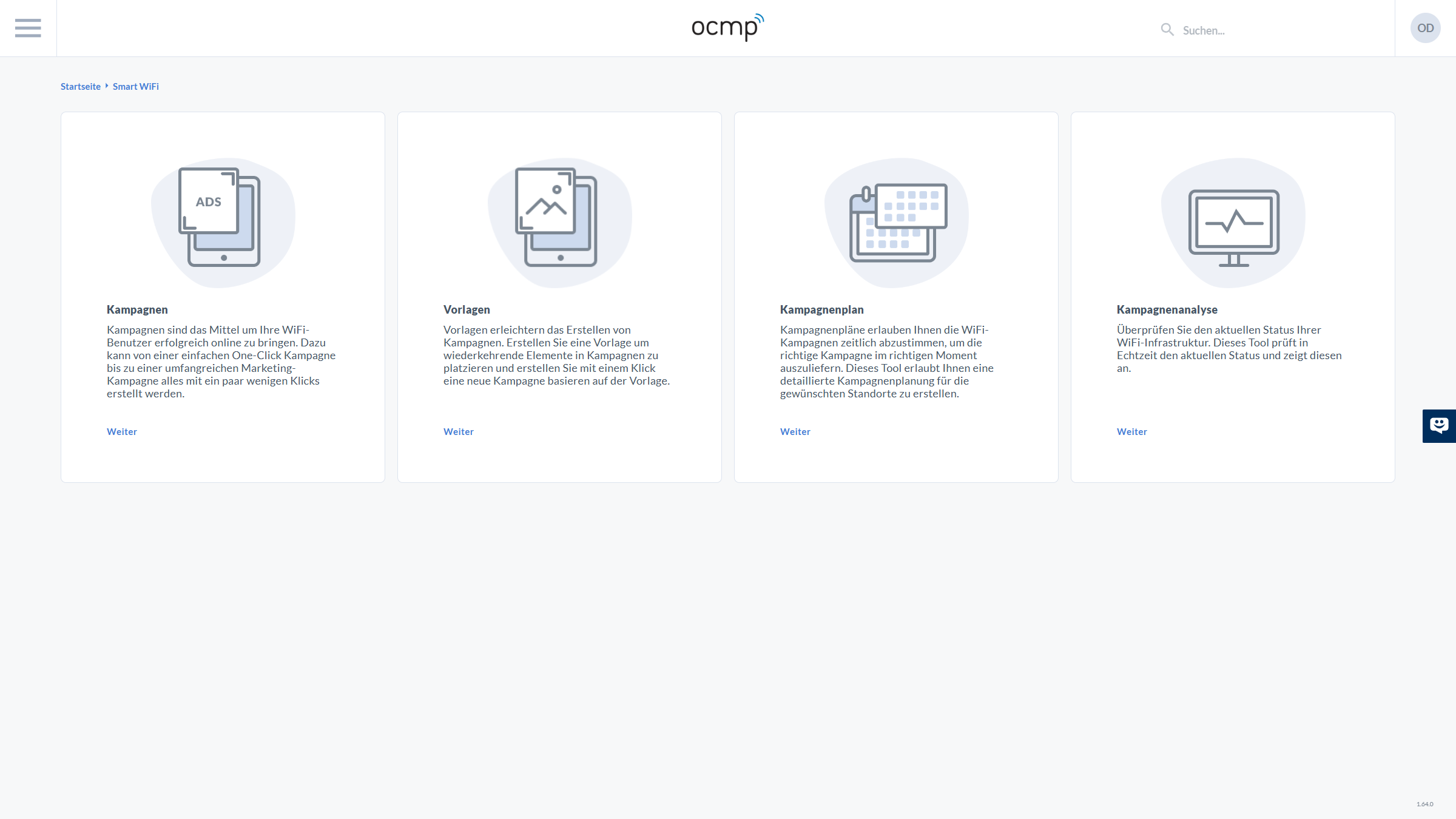
The overview page is the central entry point into Smart WiFi and consists of a clear, recurring UI structure. At the top, you can see the global header with the hamburger menu on the left for opening the main navigation, the OCMP logo in the center for orientation, and a global search field for platform-wide search. On the right, the user profile is placed as a circular avatar with initials, which typically provides access to account functions.
Directly below the header, the page shows breadcrumb navigation such as "Home > Smart WiFi". These breadcrumbs are important if you want to navigate back from deeper levels, such as the campaign editor or analytics, without using the browser back button.
In the main area, there are four large tiles that serve as entry points into the work areas. Each tile has the same structure: an icon at the top for visual classification, a title, a short explanatory text, and the clear action link Continue.
- Campaigns leads to the creation and management of concrete WiFi campaigns, including content, check-in, design, and flow.
- Templates supports standardization through reusable campaign structures from which new campaigns can be derived.
- Campaign Plan controls delivery, including time slots, priorities, and locations.
- Campaign Analytics combines evaluation features such as KPIs, journeys, and export options.
You will also see the small support/chat widget on the right edge of the screen. It is a global UI element and is available regardless of the current Smart WiFi sub-area.
Creating WiFi Campaigns
Campaign Overview
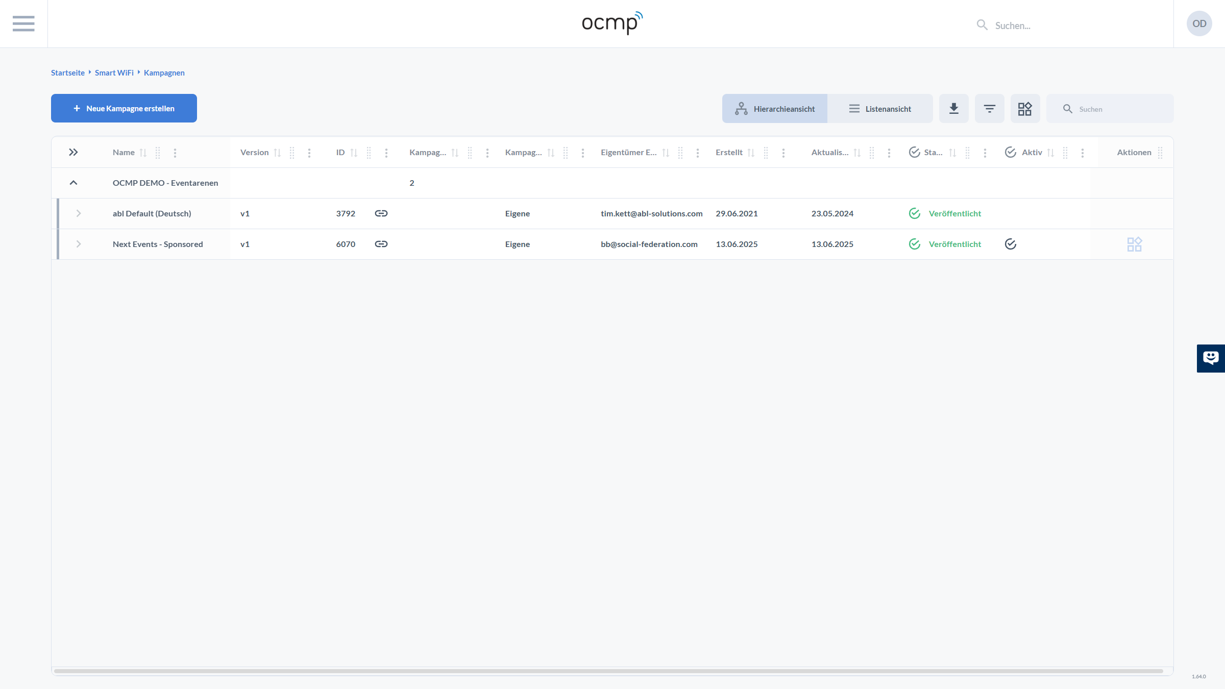
The campaign overview is the central management list. Here too, you will find the familiar header at the top, including menu, logo, search, and profile, as well as the breadcrumbs below, such as "Home > Smart WiFi > Campaigns", which clearly define the context.
In the upper-left area, the primary action is presented as a clearly highlighted button: + Create New Campaign. This button is the starting point for every new campaign, regardless of whether you begin from scratch or use a template.
To the right above the table, there is a compact toolbar that makes working with many campaigns efficient:
- With Hierarchy View and List View, you switch between two display modes. In hierarchy view, campaigns appear grouped, for example by organization, folder, or environment. In list view, the focus is on a flat table.
- The download/export icon is intended for typical export and download functions.
- The filter icon is used to narrow down the list by criteria such as status, period, or owner.
- The view/layout icon usually stands for column or view settings, such as showing and hiding columns or using saved views.
- The search input field filters the table by names or IDs without having to scroll through multiple pages.
The table itself is designed so that you can recognize the lifecycle of a campaign at a glance:
- In the left-hand column, you see expand and collapse icons that show whether an entry is a group or an individual campaign.
- The columns display Name, Version, ID, and other campaign-related attributes such as owner email, creation date, and update date. The small sorting indicators in the column headers show that sorting is possible.
- The Status is displayed with an icon such as a green checkmark and a text like Published. This makes it easy to recognize whether a version has already been released for productive use.
- In the Active column, an icon shows whether this campaign is currently being delivered.
- On the far right, Actions provides context-related functions such as opening, editing, duplicating, or linking.
This combination of view switching, search, filters, and status columns is crucial for separating productive campaigns cleanly from drafts and older versions.
Creating a New Campaign
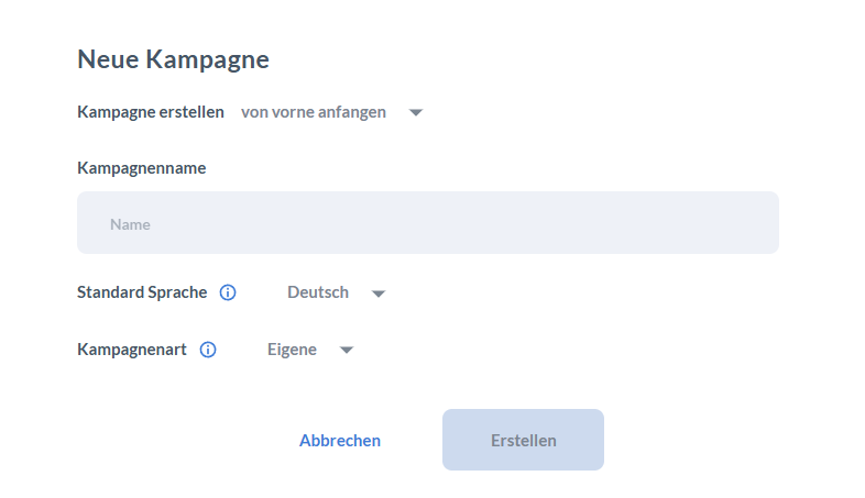
The New Campaign dialog combines all mandatory decisions before the actual design work begins. Directly below the title, you use a dropdown to select how the campaign should be created. The option start from scratch means an empty starting point. Depending on the system configuration, templates may also be available here. This first step is important because it determines whether you reuse an existing structure or start with maximum flexibility.
Below that, you will find the Campaign Name text field. The campaign name is not just a display label, but also the central reference in lists, plans, and analytics. In practice, it is helpful to use a naming convention, such as location or brand plus purpose and period, so that you can navigate quickly later in search and reporting.
Below that, you can see two dropdown fields with info icons:
- Default Language defines the campaign's base language, such as German. This setting is the basis for translations and later language logic.
- Campaign Type describes the type or category of the campaign. Depending on the platform logic, this can determine whether it is a regular campaign, a derived campaign, or a special variant.
At the bottom of the dialog, you will find Cancel to stop without creating the campaign and Create to create it. The Create button is typically only active once required fields such as the campaign name have been entered correctly.
Empty Campaign
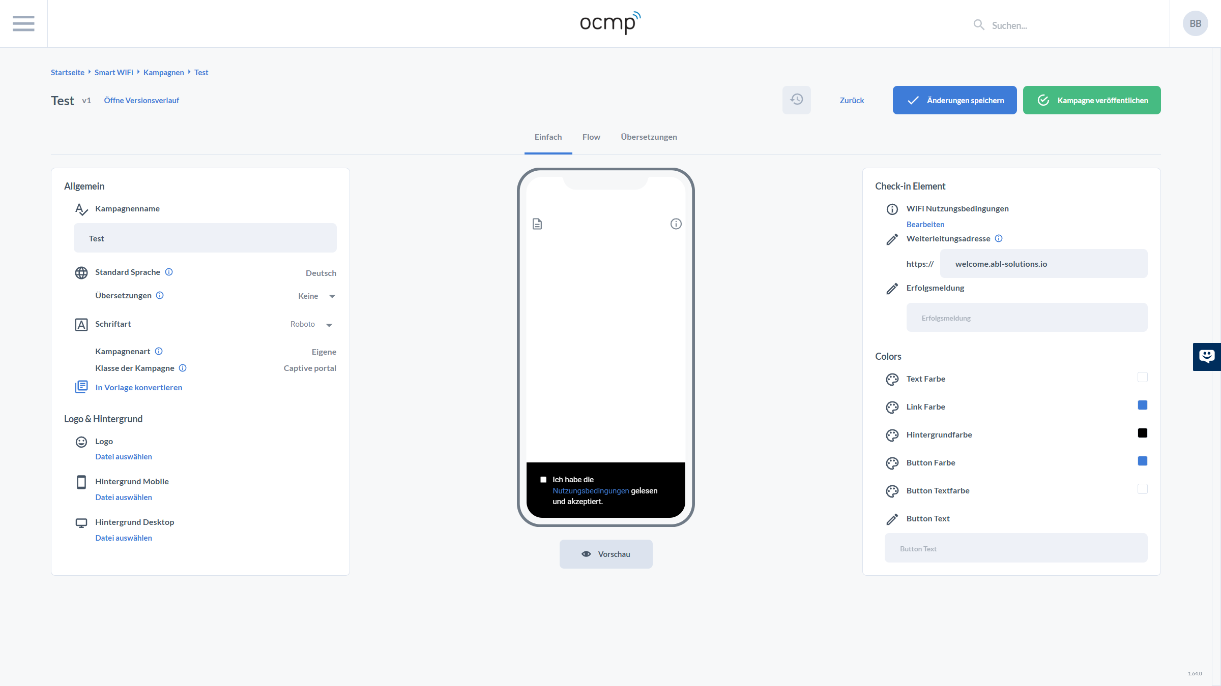
After creation, you land in the campaign detail view. In the header area, you see the campaign name, the version indicator such as v1, and the Open version history link, which gives access to the history of published versions. On the top right, the central actions are available: Back for navigation, Save changes for draft changes, and Publish campaign to create and release a new published version.
Below that, tabs control which editor is active:
- Basic
- Flow
- Translations
The screen is organized into three columns so that you can configure, preview, and verify at the same time.
Left: General
- Campaign Name can be edited.
- Default Language shows the base language.
- Translations shows whether translations are available.
- Font can be selected via dropdown.
- Campaign Type and Campaign Class classify the campaign.
- The Convert to Template link is an important governance function that allows a well-structured campaign to be converted into a reusable template.
Bottom-left: Logo & Background
- Logo
- Mobile Background
- Desktop Background
For the design of the logo, mobile background, and desktop background, please also refer to the WiFi Campaigns Style Guide. There you will find recommended formats, safe areas, and guidance for placing important content.
Center: Live Preview
In the middle, a smartphone mockup serves as the live preview. Among other things, the preview shows placeholder icons and the UI component for confirming terms of use. Below it, the Preview button with an eye icon usually opens an interactive preview mode, which is helpful for checking contrast, readability, and flow order.
Right: Check-in Element and Colors
- WiFi Terms of Use with Edit links legal documents. See also Compliance and Documents.
- Redirect Address defines where users are taken after a successful check-in.
- Success Message is the text shown after successful login.
In the Colors section, you define brand colors in detail:
- Text Color
- Link Color
- Background Color
- Button Color
- Button Text Color
- Button Text
Basic Campaign
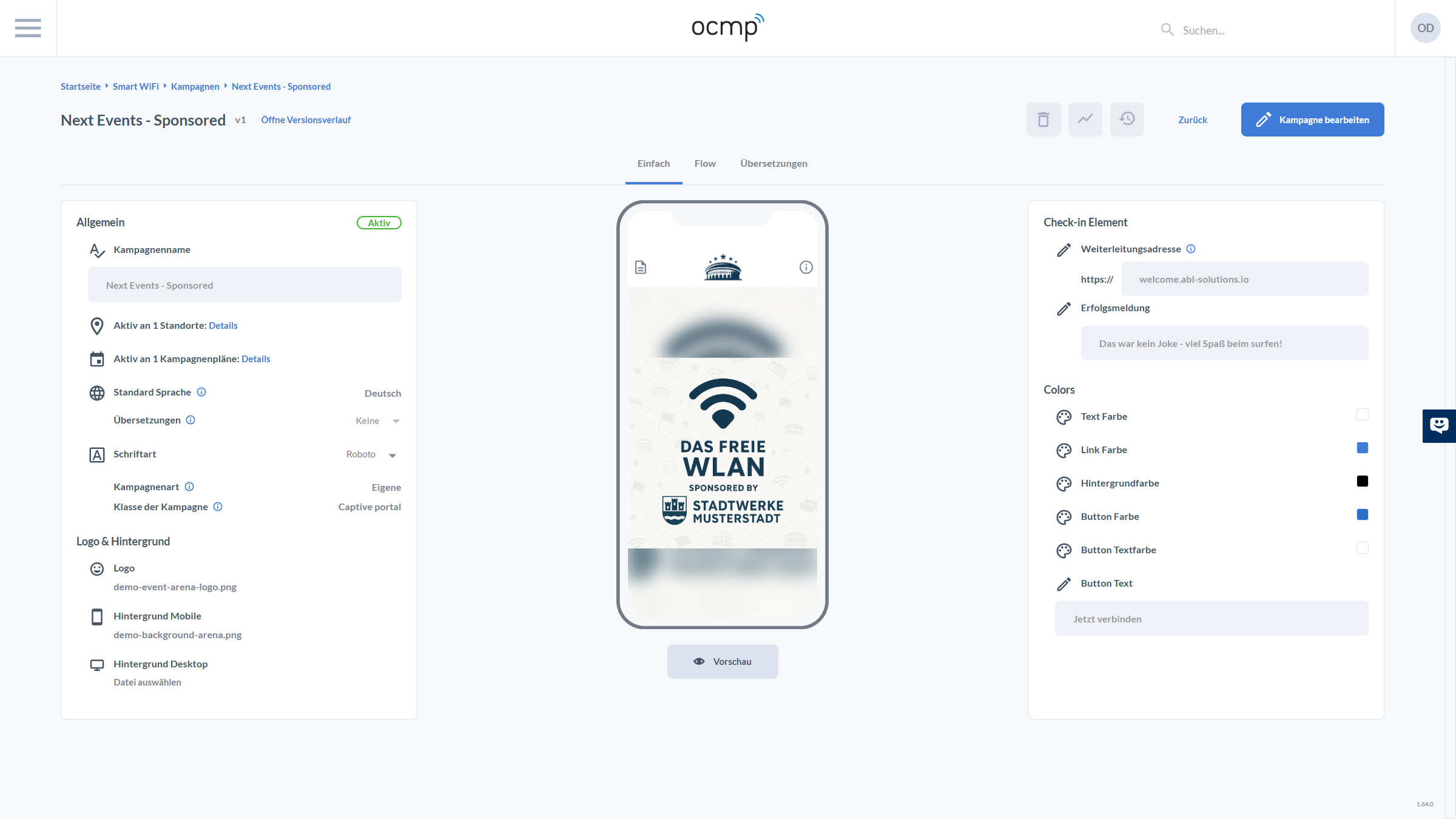
A configured campaign in the basic view additionally shows several production-related UI elements that are not yet dominant in the empty state. In the General area, for example, the Active status appears as a green badge. Below this, there are two relevant information rows with an icon and a Details link:
- Active at X locations: Details
- Active in X campaign plans: Details
These details links are often the fastest way to assess the impact of changes. If a campaign is active across many locations or plans, changes should be tested carefully before publishing.
In the upper-right header area, the Edit Campaign action is visible in this view. This is a typical pattern: editing is explicitly activated in a read-only view to avoid unintended changes.
On the left, under Logo & Background, you now see the actual file names of the stored assets instead of just a file picker. This is important in team settings because you can immediately identify which files are currently being used.
On the right, in the Check-in Element, the redirect address and success message are already filled in. In Colors, the color swatches show the active values. The button text should match the campaign linguistically and be short, action-oriented, and clear.
After publishing a campaign, three icons appear above the campaign designer: the trash icon for deleting the campaign, the chart icon for campaign analytics, and the clock icon for the action log files.
When you click Edit Campaign, a new version of the current campaign is created, which then has to be published again.
Compliance and Documents
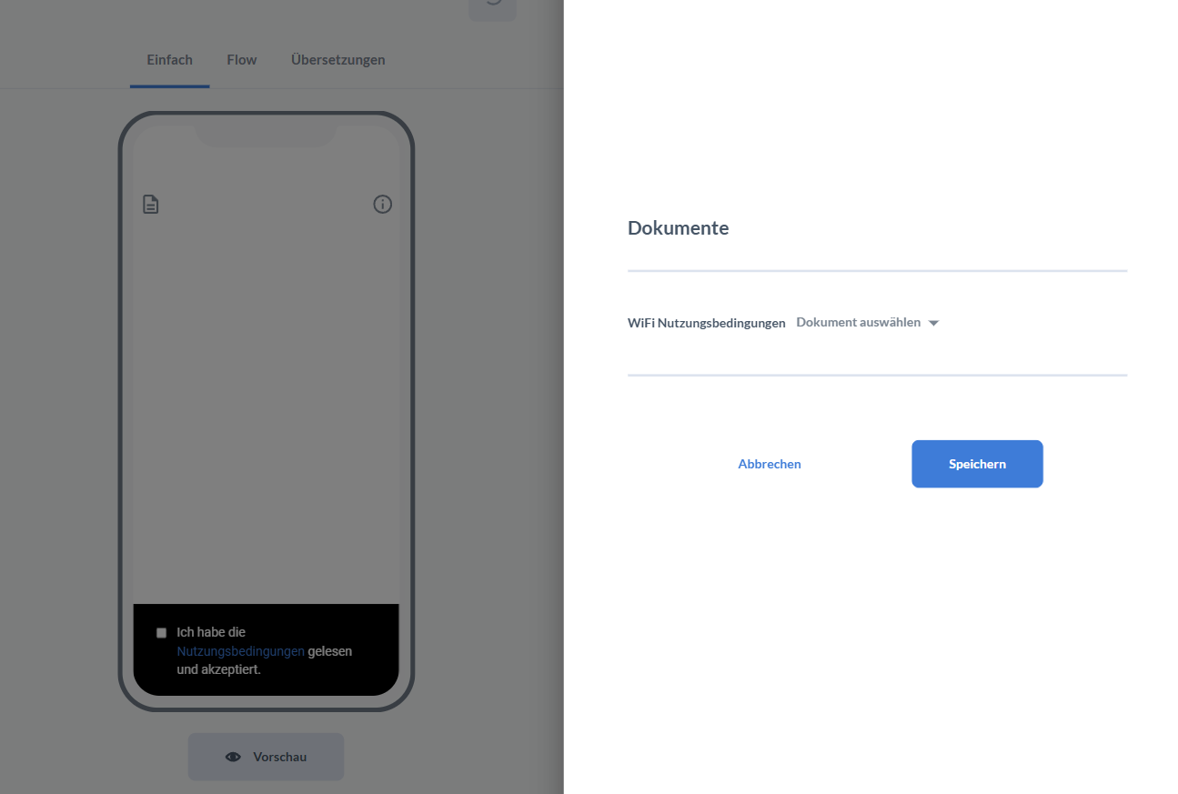
Legally relevant content such as terms of use or privacy notices is integrated via the Documents dialog, which opens as a side drawer or overlay. On the left, the campaign view remains visible in a dimmed state with live preview, while the document panel appears on the right.
In the panel, you can see:
- the Documents title
- the WiFi Terms of Use row as the specific document category
- a Select document dropdown to assign a stored document
- the Cancel and Save actions
The connection to the preview is intentional. As soon as terms of use are activated, the consent checkbox appears in the captive portal. Especially in the EU, high standards apply to consent and confirmations, particularly with regard to clarity and informed consent.
Publishing a Campaign
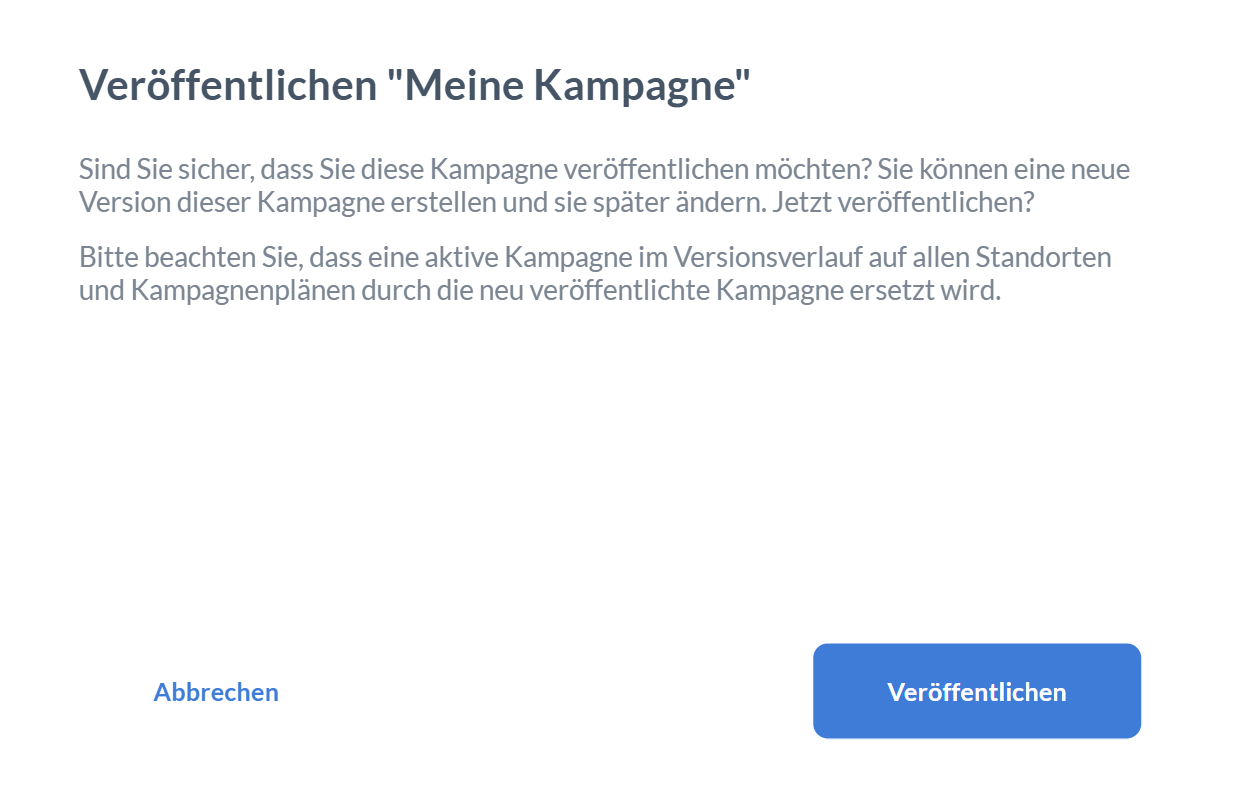
The publish dialog is deliberately worded clearly because it has operational effects. It explicitly asks you to confirm that you want to publish the campaign now, and it points out that a new version will be created. It also makes clear that an already active campaign may be replaced by the newly published version in history, locations, or plans.
The UI provides exactly two actions: Cancel and Publish. This reduces the risk of mistakes in productive environments.
Linking and Control
Campaign Plan
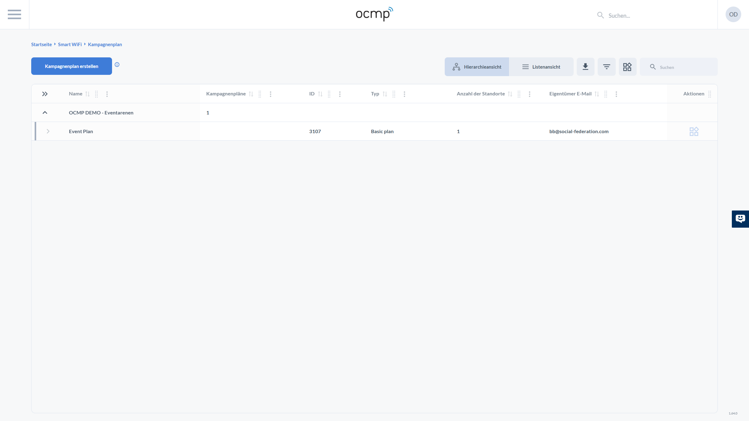
The campaign plan is the control center for rolling out a campaign across time and locations. On the top left, there is the Create campaign plan button, accompanied by an info icon.
On the top right, you will again find the familiar toolbar with hierarchy and list view, export and filter icons, and search. This UI consistency is important because campaigns, templates, plans, and analytics can all be handled in the same way.
The table shows values such as:
- Name
- Campaign Plans
- ID
- Type such as Basic Plan
- Number of Locations
- Owner Email
- Actions
Editing a Campaign Plan
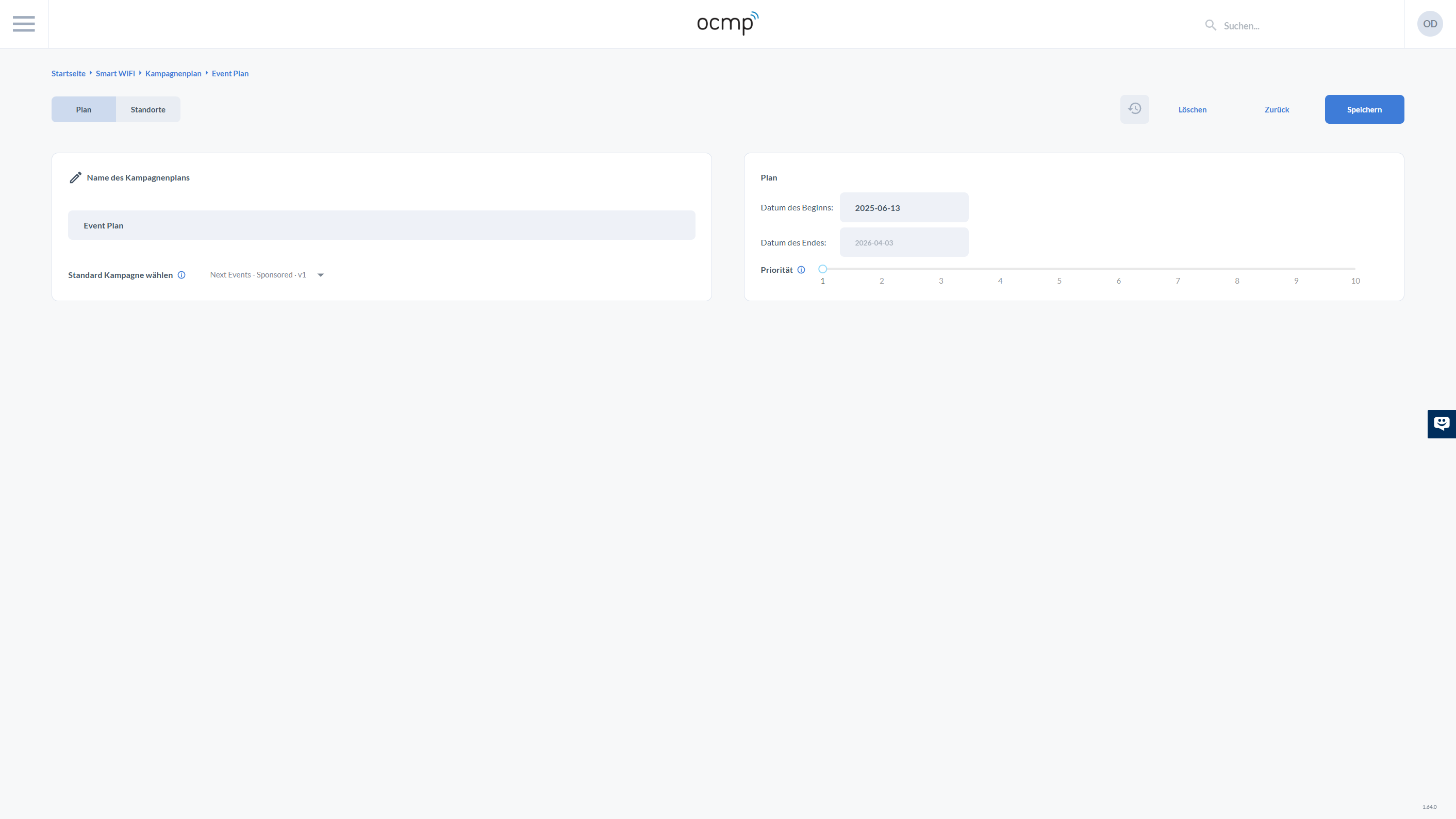
In the plan detail view, there are two tabs at the top: Plan and Locations. This clearly separates the UI logic between rules such as time, priority, and campaign on the one hand, and the target set of locations on the other.
The operational actions in the top-right corner are grouped compactly: Delete, Back, and Save. This makes the save point explicit.
In the Plan tab, two panels are visible:
- On the left, Campaign Plan Name as an input field and Select Default Campaign as a dropdown. Here you define which campaign this plan will deliver.
- On the right, under Plan, you define the Start Date and End Date. Below that, the Priority slider defines which campaign wins if multiple plans or rules apply at the same time.
Assigning Locations
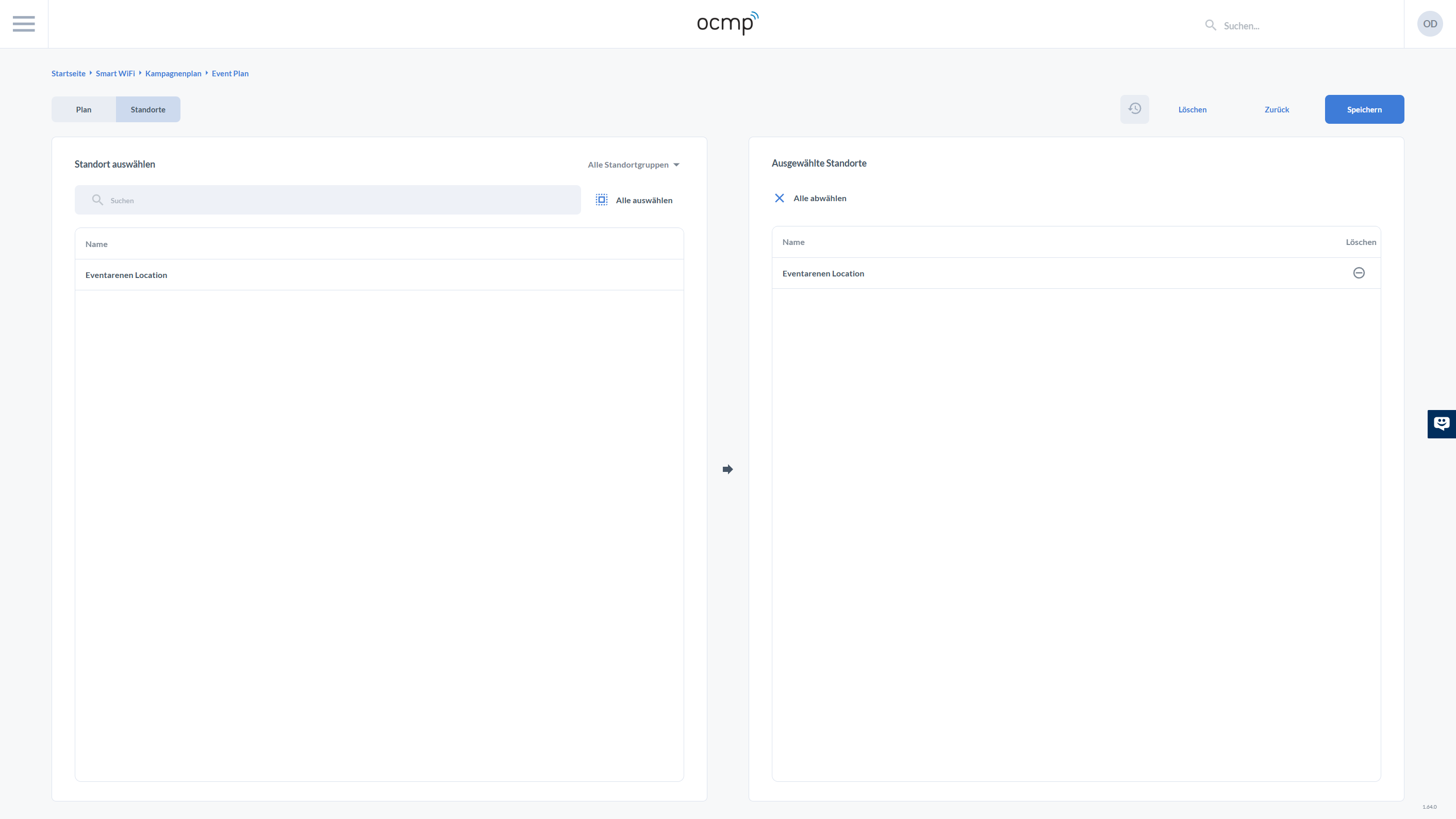
In the Locations tab, the UI is designed as a dual-list so that you can make controlled assignments even with many locations.
On the left, under Select Location, there is a search field and an All Location Groups dropdown to narrow the selection to a specific group or organizational unit. There is also a Select All action to take over the complete filtered list in one step.
On the right, under Selected Locations, you can see the locations that are actually assigned. The Deselect All action removes assignments in one step. In the table, there is also a Delete column to remove individual locations in a targeted way.
An arrow icon between the two lists visualizes the transfer logic from available to selected. After making changes, save them using Save in the upper-right corner so that the delivery becomes effective.