Style Guide
for Smart WiFi Campaigns
This guide describes how splash pages in OCMP should be structured for mobile devices and desktop views. Both variants have different aspect ratios and different critical zones. For this reason, layouts should not be derived from a single background only, but should always be created specifically for the respective delivery context.
Regardless of the format, important content such as logos, headlines, forms, call-to-actions, and legally relevant notices should never be placed at the outer edges. Browser bars, captive portal elements, notches, or cropping may cover or cut off content there.
Mobile Variant
For mobile splash pages, a vertical base format should be used. A background image in 1080 x 1920 px portrait format has proven effective. This format serves as the basis for smartphone displays and should be designed so that central content remains visible even when scaled.
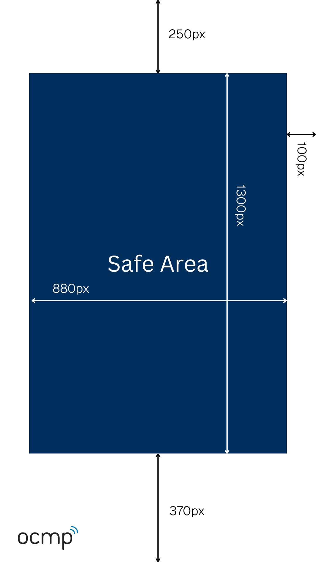
- Format:
1080 x 1920 px - Orientation:
Portrait - Ratio:
9:16 - Use:
scaling background image
On mobile devices, the safe area is especially important because the status bar, browser UI, notches, and footer areas can take up different amounts of space depending on the device. In addition, narrower or wider displays can cause horizontal cropping. All relevant content should therefore be placed exclusively within the safe area.
- X:
100 pxto980 px - Y:
250 pxto1550 px - Safe width:
880 px - Safe height:
1300 px
Desktop Variant
For desktop splash pages, a horizontal format should be used. The corresponding reference format is 1920 x 1080 px. While much more horizontal space is available, care must still be taken to ensure that content does not move too far toward the edges on smaller monitors or when browser scaling is applied.
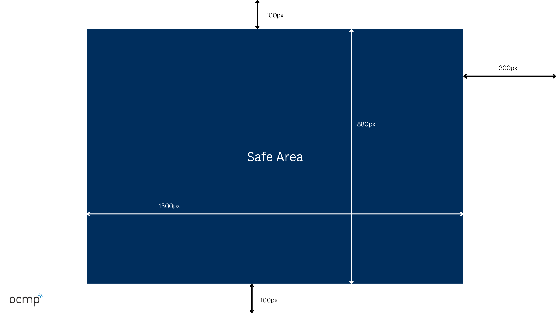
- Format:
1920 x 1080 px - Orientation:
Landscape - Ratio:
16:9 - Use:
scaling background image
Even on desktop, the design should not be thought of as purely edge-to-edge. The content focus belongs in a calm, central area. This keeps the layout robust when browser windows are not displayed full screen or when UI elements require additional space.
- X:
320 pxto1620 px - Y:
100 pxto980 px - Safe width:
1300 px - Safe height:
880 px
Design Recommendations
In practice, splash pages work best when the visual focus is clearly centered. This applies to both mobile and desktop. Central placement creates a calmer layout and reduces the risk that headlines, logos, or buttons end up in critical edge areas.
Backgrounds should be chosen in a way that ensures no essential visual elements are placed at the outer edges. If an image is cropped slightly on the sides or top and bottom, no important message should be lost as a result. Calm motifs, soft gradients, or slightly blurred backgrounds are especially robust, as they allow foreground elements to stand out clearly.
Restraint is also recommended for text. Short, clearly structured messages with sufficient contrast and clear hierarchy work much better than dense or overly detailed layouts.
- place content centrally whenever possible
- leave sufficient spacing from all edges
- use large and clearly readable elements
- choose backgrounds without critical edge details
- prefer gradients or calm surfaces
What Should Be Avoided
The most problematic layouts are those that rely too heavily on fixed screen edges. Content in corners, very high up, or directly at the bottom edge can easily conflict with browser elements, cropping, or device-specific UI zones. This is especially critical on mobile, but also relevant on desktop.
If a design only works cleanly on one reference device or in one window size, it is usually too fragile for this use case. Splash pages should always be designed to work across a broad range of devices.
- text directly at the top or bottom edge
- important content close to the left or right edge
- content in corners
- pixel-perfect alignment for individual devices
- very small font sizes
Format Specifications
For production, a clear and reduced structure for image and file specifications is recommended. Background images should be created in the intended formats for each variant. Logos generally work best as transparent PNG files so that they remain flexible on different backgrounds. At the same time, file sizes should be kept small so that the splash page loads quickly.
- Mobile background image:
1080 x 1920 px - Desktop background image:
1920 x 1080 px - Logo:
PNG with transparency - Recommended logo width:
300 to 500 px - File size: ideally
under 1 MB
Technical Note
Different devices work with different pixel densities, window sizes, and browser overlays. As a result, an image is not always delivered in a true 1:1 representation. In addition, dynamic browser bars, captive portal elements, and different aspect ratios can influence the visible area depending on the context.
That is why safe areas are not an optional recommendation, but the technical foundation for robust design. Anyone who consistently respects these areas and thinks about mobile and desktop separately will significantly reduce display problems.
Summary
For splash pages in OCMP, two variants should always be considered: a mobile version in 1080 x 1920 px format and a desktop version in 1920 x 1080 px format. In both cases, relevant content should be placed centrally and with sufficient distance from all outer edges. In practice, a flexible and calm layout is the most robust approach.