Flow Designer
In addition to standard WiFi campaigns, OCMP Smart WiFi also provides the Flow Designer, which allows you to create more extensive WiFi marketing campaigns using a visual designer.
Empty Flow
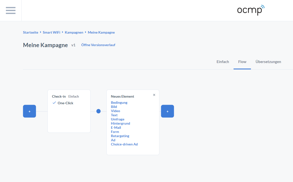
The Flow Designer makes campaigns visible as a graphical journey. At the top, the Flow tab is active, clearly indicating that you are no longer working in a linear basic configuration, but building flows on a canvas.
On the canvas, you can see:
- a + start button on the left to add elements at the beginning of the journey
- the first node called Check-in, including the note Basic and the One-Click variant
- small connection points between nodes that visually mark the transition
- additional + buttons on the right to add downstream elements
When you click a +, the New Element menu opens. This menu lists all available flow building blocks as clickable entries:
- Condition
- Image
- Video
- Text
- Survey
- Background
- Form
- Retargeting
- Ad
- Choice-driven Ad
Even in an empty flow, the core principle is already visible: nodes are content or steps, lines are transitions, and + adds a new step at a transition point.
Flow Designer Example
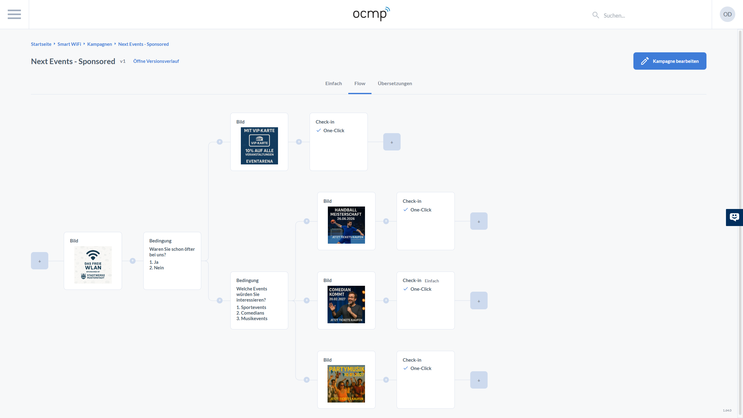
When populated, the canvas becomes a map of the user journey. You can see several UI details that are essential for modeling complex flows:
First, nodes are clearly typed. The type is shown in the top-left corner of each card, such as Image, Condition, or Check-in. Image nodes contain a mini-preview of the asset, condition nodes show the question and numbered answer options, and check-in nodes show the login variant.
Second, you can recognize the small plus circles on the transitions, which allow you to insert elements between existing steps. This is especially useful when improving a flow iteratively.
Third, at the end of a path you can see plus squares. These mark open endpoints where the flow can be extended further.
Elements in the Flow Designer
Condition
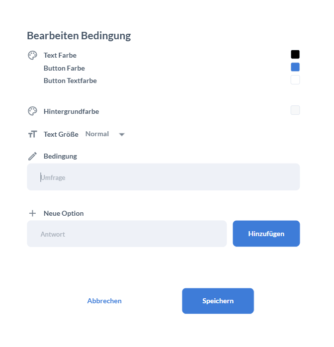
The Edit Condition dialog shows that conditions contain both logic and presentation settings. At the top, you will find visual settings such as:
- Text Color
- Button Color
- Button Text Color
- Background Color
- Text Size
The actual condition is then built in two steps:
- Under Condition, define the question.
- Under New Option, create the answers by entering the answer text and adding it to the list.
At the bottom, you can confirm with Save or discard changes with Cancel.
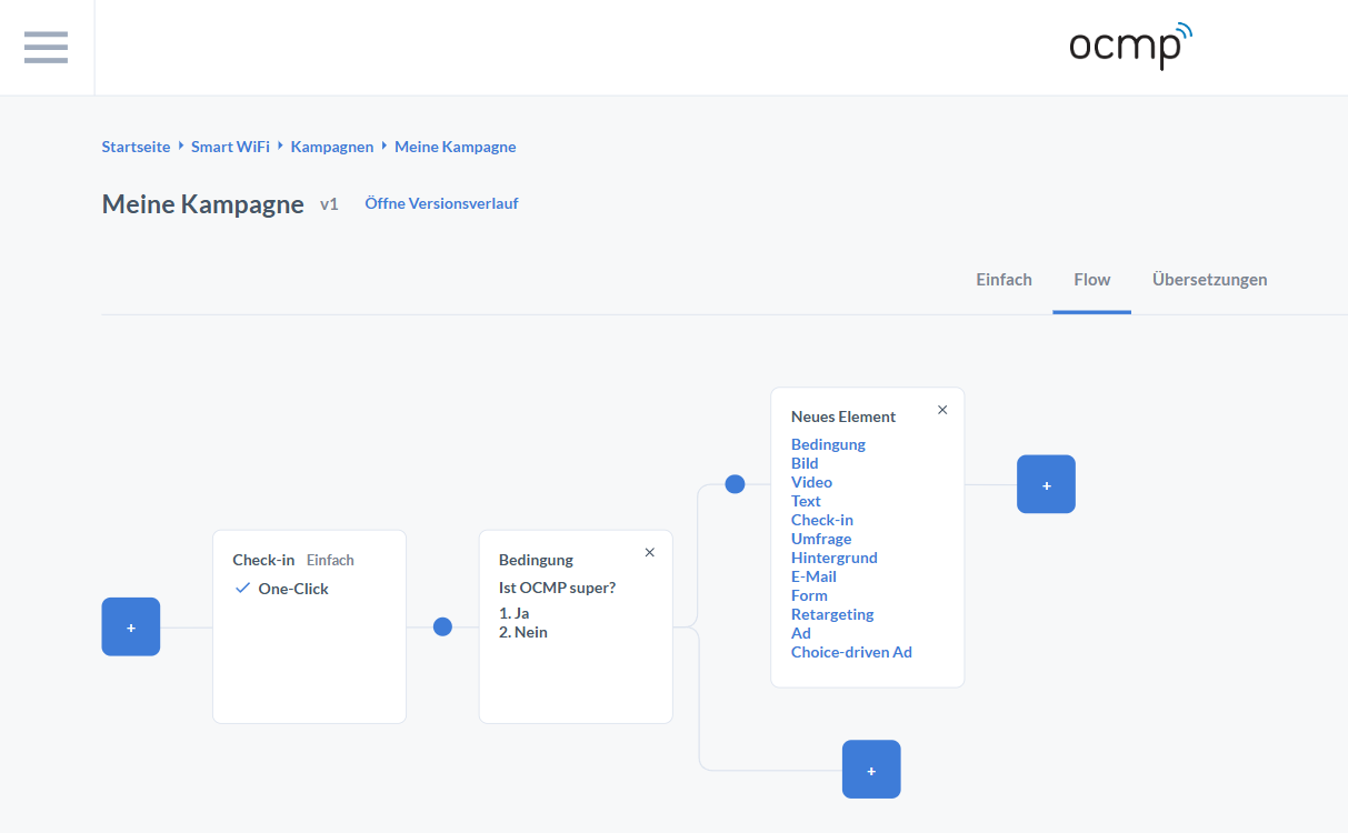
In the canvas view, a completed condition card displays the numbered options directly inside the node. An X may be visible on the right side of the node to remove it again. The key point is the branching: several transitions can lead away from the condition, each of which can be extended with a +. This creates the typical pattern of one question leading to multiple paths.
Image and Video in the Flow
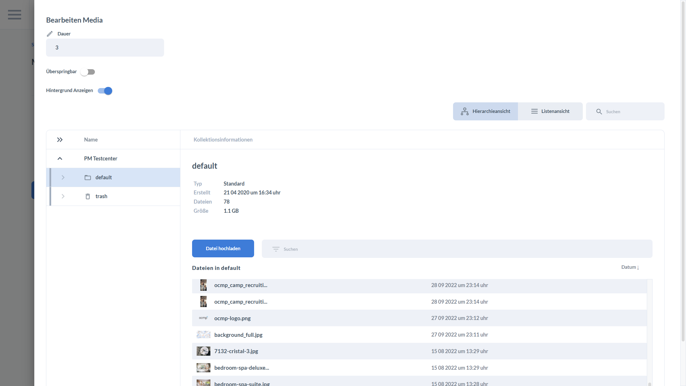
Media elements such as images and videos are often the most attention-grabbing steps in a flow. The Edit Media dialog shows the three levels that are typically controlled there:
-
Playback behavior
- Duration defines how long a medium is displayed or how a sequence is timed.
- Skippable determines whether users may skip this step actively.
- Show Background controls whether the medium is rendered in front of an additional background.
-
Storage and organization
The integrated media browser offers Hierarchy View and List View. A search field helps you locate files quickly without opening folders manually.
-
Selection and upload
On the left, you see a folder or collection structure. In the center, the UI displays collection information such as type, creation time, number of files, and size. The Upload File button allows you to add new media directly from the dialog.
Recommendation: Keep media collections well organized, including naming conventions and separation by brand or location, so that flows do not accidentally point to the wrong assets.