Analytics
for evaluating and analyzing Smart WiFi campaigns
Analytics starts with a selection view. You see a table in which campaigns, sometimes grouped, are listed. The typical workflow is to first select the relevant campaign and then switch to the detailed analysis.
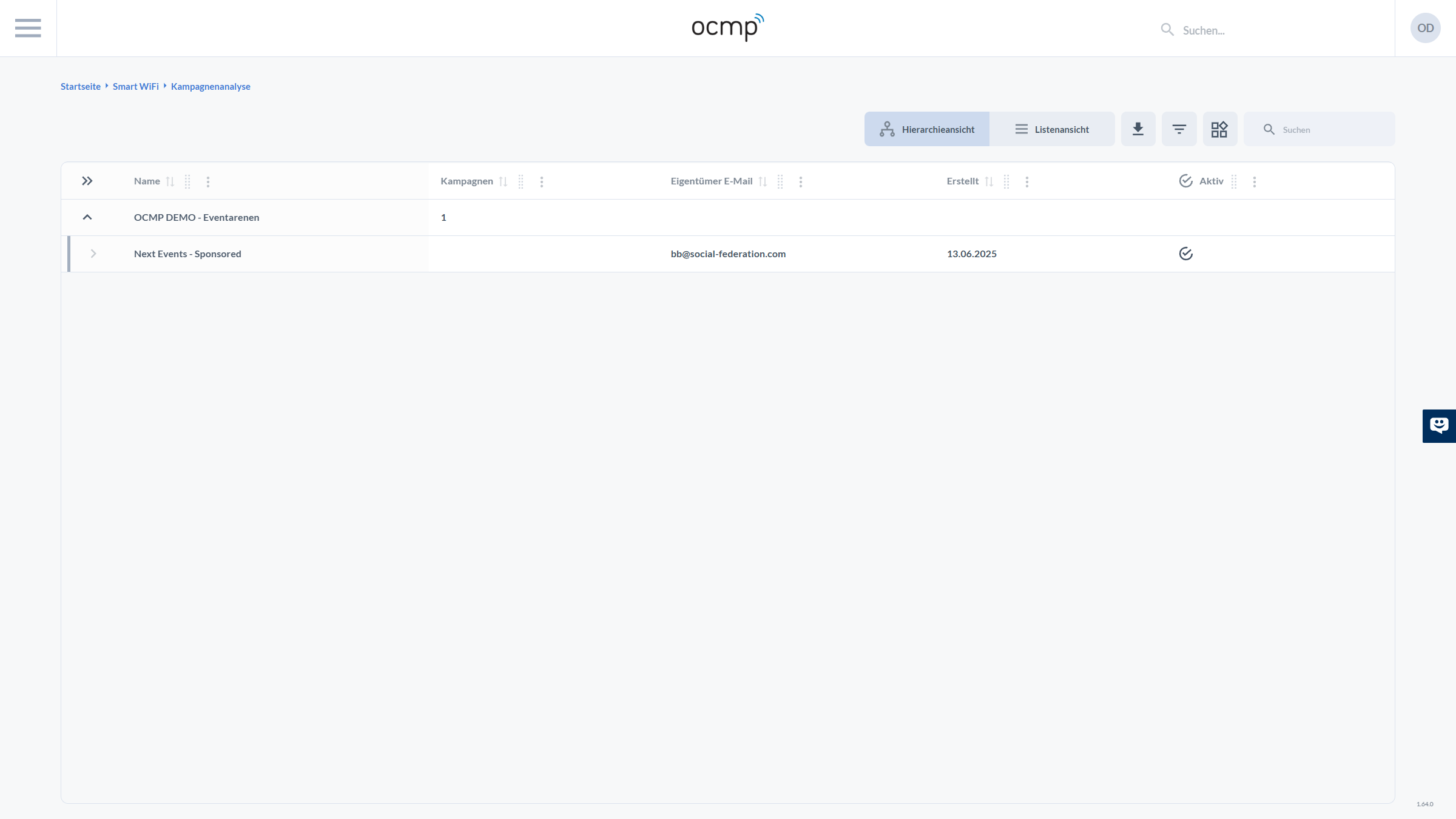
In addition to the name, the table shows values such as the number of associated campaigns within groups, owner email, creation date, and whether a campaign is active. Using the familiar toolbar with view, export, filter, and search, you can quickly find the correct record even in larger environments.
Detailed Analysis
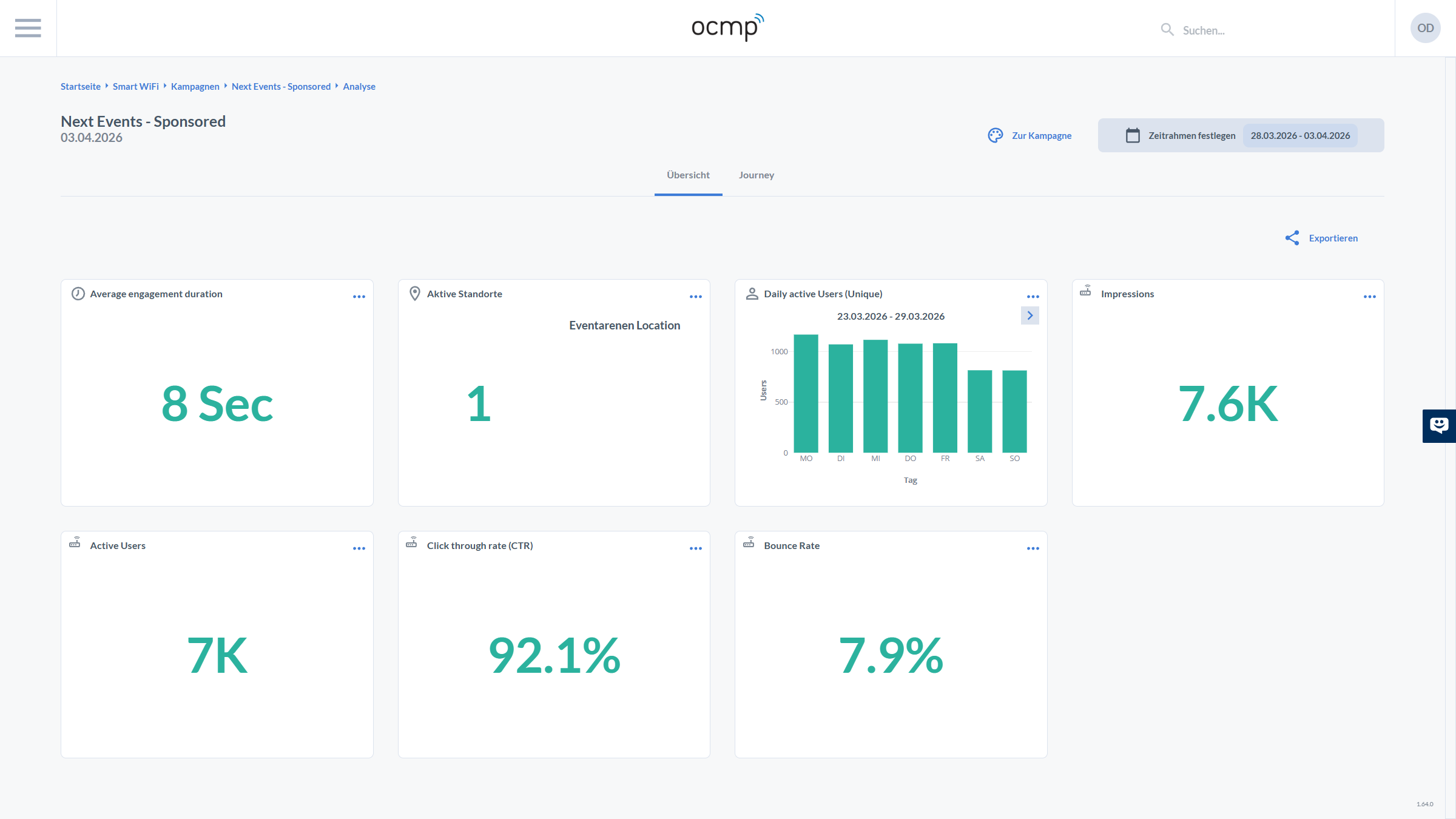
On the detailed analysis page, you can see the context line at the top, including breadcrumbs up to Analytics, the campaign name, and a date. On the right, there are three central controls:
- To Campaign takes you back to campaign configuration
- Set Time Frame defines the reporting period
- Export typically provides export options such as CSV or reports
Below that, you can switch between Overview and Journey using tabs. In the overview, KPIs are displayed as cards.
The visible KPI cards in the screenshot are:
- Average engagement duration
- Active locations
- Daily active Users (Unique)
- Impressions
- Active Users
- Click through rate (CTR)
- Bounce Rate
These metrics help evaluate visibility, interaction, and dropout behavior within a campaign.
Journey Analysis
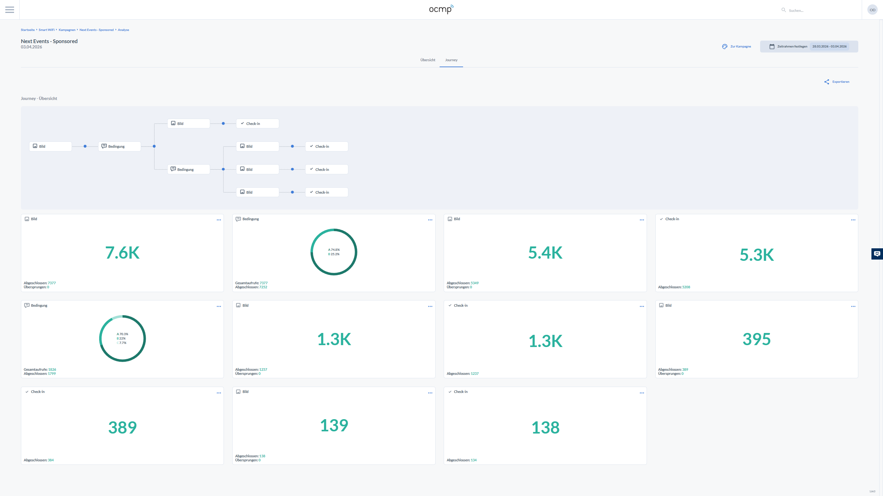
The Journey view is the bridge between flow design and measurement. At the top, you see a simplified visual representation of the route with nodes such as image, condition, and check-in. This makes it immediately clear which part of the flow is being evaluated.
Below that, the individual journey steps are displayed as KPI cards. Each card is assigned to an element type and shows a central volume value together with specific counters:
- For image steps, you typically see Completed and Skipped
- For condition steps, you see a ring visualization with shares and values such as total views and completed
- For check-in steps, you see the number of completed check-ins
These journey cards allow very targeted optimization. If an image step has a high skip rate, it may be too long, not relevant enough, or poorly positioned. If a condition step has many dropouts, the question may be too complex or the options may be unclear.